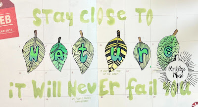
Hello! Welcome back to the BPM blog. I have another art journal page created for you. This time, I created a double page spread. I hope you like it.
The BPM products I used on this spread are:
I first looked for a quote related to leaves. I planned how I would want to illustrate this quote using the stencils.
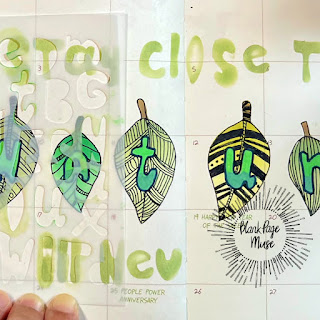
I started with the ink blending of the leaves which is the focal point of the double page spread. To make the leaves centered, I counted the number of letters of the word that I want to highlight, in this case, it is 'nature.' I positioned the stencil with a leaf close to the center spine.
I masked the open areas around this leaf to prevent inking these surrounding areas.
I wanted the leaf stem to be brown in color. I used a smaller blending brush to apply the brown color. I masked the inked leaf which I skipped doing with the rest of the leaves. Using a smaller blending brush gives more control in adding a different color to this part of the leaf.
I used different shades of green inks for my leaves. I started blending with a light hand adding more pressure towards the part of the leaf connected to the stem. Another way to achieve this is to use different shades of green inks on a leaf.
I continued blending ink until I have enough leaves for each letter of 'nature.'
For the letters, I used an acrylic marker. I should have conditioned my marker before using it. And, I should have allowed the ink to dry before proceeding to the next letter. You will see below how I sort of messed up the letter e. This will be covered by the marks later on.
I blended a light and dark green acrylic marker on each letter. The acrylic marker is opaque that the pigment stood out over the blended ink on the leaf.
I used a black marker to outline the letters to make the letters pop-out.
I added marks to each leaf using a black gel pen.
For the rest of the letters, I used the same small blending brush to apply the ink. Just like with the leaf, I started inking the letter which is in the middle of the phrase moving sideways to complete the sentiment.
Initially, I was using a mask to prevent inking on the next letter but later on stopped doing this. Using a small brush makes it unnecessary to mask.
I used a pastel green gel pen to add shadows to the ink blended letters for additional details.
I hope you give this art a try.
Visit our social media sites for more stamping fun!
I Brake For Stamps -https://ibrakeforstamps.com/
The Blank Page Muse- https://blankpagemuse.
FB Fan Page- https://www.facebook.
Instagram Shop- https://www.instagram.
Instagram Blog- https://www.instagram.
Twitter- https://twitter.com/
Have a blessed, brilliant and creative day!
Maria Giselle B.


No comments:
Post a Comment
Thank you for visiting and leaving your kind words!
~~~
A note regarding the GDPR and EU ePrivacy Regulation:
Those leaving a comment on any post on this blog do so on the understanding that their name and personal details will be visible to anyone who visits this blog.
People entering a piece of artwork into any competition or giveaway promoted here, they do so in the knowledge that their name and blog link are visible to all who visit this blog and in so doing have published their own personal details and consented to our use of that personal information should it be selected as a winner.
Thank you.