Hi, friends! It's design team member Walter here on the blog with you. Today I'm sharing my third card for the theme of Beauty in Botanicals. For me, there is something so beautiful about a monochromatic card with just a pop of color. I find them to be dramatic with a certain feeling of softness to them. I thought it would be a great way to illustrate this month's theme. This card tells a story of being brave enough to embrace change, finding growth, and moving on. It may be moving on from a situation, a feeling, or whatever the case may be. It's a great card to share with someone who needs to hear those words and begin that process.
Here's what I used to make it:
Here's how I made it:
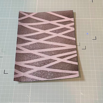
I started with stenciling the background first. I thought that the Intersection stencil would provide a nice background of crisscrossed lines to provide both some color and some non-floral design. I wanted the background to contribute to the design but not take away from the flower. I aligned my stencil and ink blended with Cloudy Night Ink. I then went over it with Silver Lake ink to add a little variation to it.
I then misted the stenciled card panel with some Brutus Monroe Pearl Shimmer Mist Spray. This gave it a little bit of pearlescent shine so that it didn't look too flat.
I cut two pieces of a gray & white ribbon and decided to place them at an angle in the top left and bottom right corners. I did this to break up the pattern a bit and provide separate places to put each word of the sentiment. Double sided tape was used to adhere the card panel to the card base.

Next up was stamping and coloring the image. I stamped it with black ink and started by coloring the shades of gray first. I worked my way around the stamped image and filled in the objects other than the flowers with neutral gray tones. I used the darkest gray around the edges of the flower to add some shadow, and the lightest one of the fairy's wings. Once done, I used a Nuvo Shimmer Pen to add some sparkle to the fairy's wings . . . a little touch of magic! I used three shades of red to color the flowers: starting with a darker one in the center and shadow areas, blending it with a medium shade, and then blending the entire image with a lighter shade. I used a yellow in the center, and two shades of green on the leaves. Once happy with the image, I put double sided foam tape on the back of the image and adhered it to the base. Three clear acrylic bubbles were added and the card was complete!

I think this card is a fun way to use flowers as a pop of color and beauty as a sign of change and happiness on the horizon. What do you think? Do you like this type of design? I'd love to know!
Thanks for spending some time with me here on the blog. I'll see you again next month for a new theme. Until then . . . be well!


No comments:
Post a Comment
Thank you for visiting and leaving your kind words!
~~~
A note regarding the GDPR and EU ePrivacy Regulation:
Those leaving a comment on any post on this blog do so on the understanding that their name and personal details will be visible to anyone who visits this blog.
People entering a piece of artwork into any competition or giveaway promoted here, they do so in the knowledge that their name and blog link are visible to all who visit this blog and in so doing have published their own personal details and consented to our use of that personal information should it be selected as a winner.
Thank you.