Showing posts with label card making. Show all posts

Friday, August 29, 2025

Summer Fun - Take My Hand

Hi, friends!  It's design team member Walter on the blog with you today.  The design team's theme for the month of August is Summer Fun.  What's more fun that time at the beach?  My card today celebrates the beauty of summer, the beauty of the beach, and the beauty of being with someone special.  Let's jump into the design process!


Here's what I used to make it:

Here's how I made it:

I started by spraying some of the Dusk and Ocean Waves inks onto my glass craft surface.  Using a baby wipe, I applied each color to the white card panel.  I applied the Dusk halfway down the panel, switched to the clean end of the baby wipe, and applied Ocean Waves down the remainder.  This technique is an easy way to apply inks when you're not looking for even coverage.  The sky and the coean have natural variations to them and the blotted effect looks great for each.


I could now begin to later in the rest of the background.  I created it using a layered stamping approach using different colors to build up the color.  I wanted this image to be more like a silhouette since the couple stamp for the scene is also a silhouette and this will give that effect.  I first stamped the beautiful Lighthouse and Ocean stamp using Altenew Silver Lake Crisp Dye Ink to create the base silhouette layer.  I then stamped it with Hazelnut ink to add some lighter brown into the beach area and then stamped just the lighthouse and terrain level with Milk Chocolate ink to darken the farther area on the horizon.


I cleaned the stamp, inked the cloud area of the stamp with Yeti white pigment ink and stamped it.  I repeated this a couple of times until I had white cloud formations in the sky.


I was so happy with the background came together!  I used a white gel pen to add some wave foam caps and a black fine tip marker to darken the seagulls in the sky.

It was now time to stamp the couple.  I carefully applied black pigment ink to the couple while trying to avoid the flowers on the stamp.  I was okay with getting the grass in the image since there is sea grass on many beaches.  I stamped them a couple of times to get a nice black impression.  Once stamped, I added additional sea grass with a fine tip black marker.  I then position my sentiment and stamped it with black ink.  The panel was now complete!  I set it aside and let it dry for a while to avoid smudging any ink as I applied the panel to the card base.

I'm truly happy with how this card turned out!  The landscape is beautiful, and couple looks very natural in it.  This is what I love about Blank Page Muse stamps . . . you can combine various stamps to create a beautiful scene!


Thanks for spending some time with me here on the blog.  I'll see you again next week for more stamping fun.  Until then . . . be well!


Be sure to visit our social media sites for more stamping fun!


Thursday, July 24, 2025

Christmas in July - Twas the Night before Christmas with Walter

Hi, friends!  It’s Walter on the blog with you today with my final project for Christmas in July. Christmas is such a magical time for all of us - young and old.  That magic is expressed in so many songs and stories of the season - but in none more than Clement C. Moore's classic poem, "Twas the Night before Christmas."  The idea of Santa Clause being seen by an adult and that adult telling others, young and old alike, about what he spied brings so much joy.  That joy is perfectly captured in the Twas the Night before Christmas Rubber Stamp.  Santa flies over the tops of the buildings guided by eight reindeer as the city below sleeps and waits for his arrival.


Here's what I used to make it:

  •  Twas the Night before Christmas Rubber Stamp
  • A2 white card base
  • A2 piece of Christmas patterned paper
  • 4"x5.25" piece of gold glitter cardstock
  • 3.75"x5" white card panel 
  • Alcohol markers
  •  Gel pens
  • Nesting rectangle dies
  • Antique Linen and Tea Dye Distressed Inks
  • Salvaged Patina Oxide Ink

Here's how I made it:

I began by adhering the piece of patterned Christmas paper onto the card base.  I created a frame from the gold glitter cardstock using two nesting rectangle dies.  I used one that was approximately 4"x5.25" and one two sizes smaller than it.  I ran this combination through my die cut machine to cut out the center.  Vintage Patina Distress Oxide ink was gently applied around parts of the frame to add some age to it.


I stamped the image onto the white card panel and began to color.  I colored the image using a combination of alcohol markers and gel pens.  The gels pens were mostly used for details (rooftop snow, house lights) and small areas (Santa's sleigh) and the alcohol markers for the rest.  Once finished, I applied Antique Linen and Tea Dye Distress inks to add some vintage grunge.


The final steps were to adhere the stamped image to the card and then the frame over it using double sided foam tape strips.

This is such a fun card that would be wonderful to send to a family with children.  I can only imagine the "ooh's and ahh's" as the gaze upon it! 

Thanks for spending some time with me today.  I’ll see you again next month with more posts.  Until then . . . be well!

Be sure to visit our social media sites for more stamping fun!


Wednesday, July 16, 2025

Christmas in July - Sleigh it! with Walter

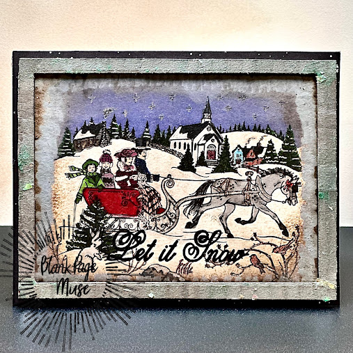
Hi, friends!  It’s Walter on the blog with you today with another Christmas in July.  I've always loved the art of Currier and Ives.  It's so nostalgic, folksy, and pretty.  Each piece is so full of detail that it's so easy to tell a story with it.  It seems like there is a book in every print!  That was my inspiration for this week's card - a similar type of of look and feel and one that tells a story.  I want to jump right in and live here!


 Items used to create it:

Here's how I made it:

I began by adding Lost Shadow splatter to the Navy card panel.  To do this, I smooshed the ink pad onto my glass crafting surface, spritzed with water, mixed it with a paint brush, and then flicked that mixture onto the card panel.  Once dry, I adhered the panel to the card base.

I created a frame from the cardboard using two nesting rectangle dies.  I used one that was approximately 4"x5.25" and one two sizes smaller than it.  I ran this combination through my die cut machine to cut out the center.  I then rubbed the frame with Sizzix Silver Luster Wax to give it a nice silver metallic look.  An alternative is to use Brushed Silver cardstock for the frame; however, I think that the Luster Wax gives it more of a vintage look.  I then spread some Brutus Monroe Coastal Mint Cosmo Glaze across certain portions of the frame to give it the look of a patina being formed on the frame.  This is to age it and make it look more vintage.  You may achieve a similar look using Vintage Patina Distress Oxide ink.  The difference is that the Cosmo Glaze has little bits of glitter in it that give the patina a bit of sparkle.


I put the frame aside to dry and stamped the Sleigh Ride image onto the 3.75"x5" white card panel.  I decided to color the panel using a combination of alcohol markers and gel markers due to all of the detail in the image.  Alcohol markers and gel pens give you more control over the coloring then watercolor, which is another fine method for coloring it.  You may use whatever colors set the scene you want to see.  For example, I knew that I wanted the scene to be at night rather than during the day and that impacted my decision to color the sky a darker blue.  As you color, don't forget to add in details like snow on the tress (accomplished with a white gel pen), lights in the windows (a yellow gel pen), and varying colors on the stone wall and chimney.


Once happy with the coloring, I wanted to add a border around the outside of the ink to make it look like the print was painted without clear borders and a jagged edge.  I created this effect by using a small blending brush and adding Lost Shadow Distress Oxide ink around the edges to blur them.  I then added varying degrees of vintage grunge to the image using Antique Linen. Tea Dye, and Vintage Photo Distress Inks.


To finish the card, I adhered the stamped panel to the card base and then adhered the frame around it.


This was such a fun card to create and I am very happy with how it turned out.  All of the detail and aging really helps make it stand out vs. a more simple stamp and color process.  As a bonus, the recipient may choose to frame it and use it as a Christmas decoration.  It's exactly what I would do if I received it!

Thanks for spending some time with me today.  I’ll see you again next week with my final Christmas in July project.  Until then . . . be well!


Be sure to visit our social media sites for more stamping fun!


Thursday, July 10, 2025

Christmas in July - Victorian Skaters with Walter

Hi, friends!  It’s Walter on the blog with you today and the team is celebrating Christmas in July this month.  It’s hard to believe that we’re halfway through the year already.  Keep in mind though that it’s never too early to start making your Christmas cards!  Today I’m featuring what may be my most favorite stamp from Blank Page Muse: Victorian Skaters Art Rubber Stamp.  There is something so magical and nostalgic about this stamp.  It reminds me of a scene from A Christmas Carol or the great musical film, By the Light of the Silvery Moon.  Two people skate along on a pond on a cold winter’s night and enjoying the magic of the season.  It’s a scene that anyone would love to receive on a card!


I used the following items to create it:


Here’s how I made it:

I began by stamping the snowflake border onto the card base with clear emhossing ink.  I repeated it several times across the panel, applied the Alabaster Sparkle embossing powder, and heat set it.  Alabster Sparkle is a white embossing powder that has fine glitter mixed in with it to add some shimmer to each snowflake.  You may always substitute regular white embossing powder or a color of your choice.  Light blue would also look nice set against the dark blue cardstock!


The next step was to stamp the image of the Vitorian skaters.  I decided to heat emboss them with black embossing powder to really make them stand out and add some dimension.  Once again, I stamped with clear embossing ink, applied the Raven embossing powder, and heat set it.

I colored the image with alcohol markers to ensure rich color and shading.


Once colored, I went over the ice with a light cool gray alcohol marker to further blend it and add additional shading.


I dried the panel with my heat tool on low to make sure all of the ink was dry and set, and then used a small paint brush to apply a coat of Brutus Monroe Fall Snow Glitter glaze to everything but the skaters.  I did this to make the sky, snow, and ice sparkle.  It helps add further dimension to your card by making the background stand out from the skaters.


Once dry, I used a Nuvo Shimmer pen to add some shimmer to the skaters.  This makes them have a slight shimmer that is different than sparkle on the background.  This again makes them stand out against the background and adds more dimension.


I used a larger oval in my stacking ovals die set, centered it on the scene, and cut it out with my die cut machine.  I choose to do this to make it look more like a framed image set against the snowflake embossed background.  I ran a silver metallic marker around the edge of the oval panel, applied double sided foam tape to the back, and adhered it to the card base.  I stamped the sentiment, cut the strip to size, and applied it to the card.


I truly love this card!  I love the image, the story it tells, and how much dimension was achieved with the coloring and glazes.  It actually looks like the skaters are coming off of the card when the light hits it a certain way.

Thanks for spending some time with me today.  I’ll see you again next week with another Christmas in July project.  Until then . . . be well!

Be sure to visit our social media sites for more stamping fun!


Monday, June 23, 2025

Stone Floral Creativity Challenge ~ Team Stamp Play


Hi, friends!  It's design team member Walter here on the blog with you.  This week I'm sharing my third card for June that I made using the same four stamps for the month: Texture Wet Cement StampEtched Stone Flower Rubber Art StampFern Art Rubber Stamp, and Sentiment Words Stamp Create Something.  For this third card, I wanted to use these stamps to create a very clean, simple, and elegant design.  When I think of elegant designs, my mind often does to one that includes gold and black.  That was the inspiration for this design.  I think that I met the challenge!


I used the following in addition to the four stamps mentioned above:

  • Cream A2 card base
  • 4" x 5.25" Black card panel
  • Gold Pigment Ink
  • Nuvo Gold Metallic marker 
  • Clear acrylic bubbles 
  • Scrap of white cardstock for the sentiment
Here's how I made it:

This is a very simple card to create.  That said, I think the the elegant simplicity of it makes up for lots of bells and whistles.  I placed my black card panel onto my stamping platform and stamped the Stone Flower onto it with Gold pigment ink.  I stamped each flower three times in three different spots to get the gold ink dark enough to be seen on the black cardstock.


Once done with the flowers, I used the Fern Stamp and stamped onto the card panel with Gold pigment ink.  Once again, I stamped it three times in three different spots.  Once done, I used a heat tool to make sure that the pigment ink was completely dry.  I ran the Nuvo Gold marker around the edges of the black card panel, then ran it around the outside edges of the card base, and then adhered the panel to the base using double sided tape.


I stamped the Texture Wet Cement background onto the white piece of scrap cardstock and let it dry.  Once dry, I stamped the sentiment stamp with Black pigment ink.  Detail scissors were used to trim the sentiment to size.  I ran the Nuvo gold marker around the edges of it, put double sided foam tape onto the back of it, and adhered it to the card.

For embellishments, I took three clear acrylic bubbles, colored the bottom with the Gold Nuvo marker to add a splash of gold to it, and then glued them down onto the the card.  The card is done!


As I said, it's a very simple card to make.  I find the design to be very pretty though and it's a good example of how you can use four very different stamps to create an elegant design.

Thanks for spending some time with me here on the blog.  I'll see you again next month for more stamping fun.  Until then . . . be well!


Be sure to visit our social media sites for more stamping fun!


Monday, June 16, 2025

Stone Floral Creativity Challenge ~ Team Stamp Play

Hi, friends!  It's design team member Walter here on the blog with you.  This week I'm sharing my second card for June that I made using the same four stamps for the month: Texture Wet Cement StampEtched Stone Flower Rubber Art StampFern Art Rubber Stamp, and Sentiment Words Stamp Create Something.  For this second card, I was inspired by memories of the chalkboards from grammar school.  On really cold days, the teacher would often let us stay inside during recess and one of my favorite things to do was draw on the chalkboard.  We'd draw everything from flowers to stick figures, but one of my favorite scenes to draw was a sunset between two mountains.  I couldn't recreate that using these four stamps, but I create a chalkboard inspired design.


I used the following in addition to the four stamps mentioned above:

  • White A2 card base
  • 4" x 5.25" Black card panel
  • White Pigment Ink
  • Lost Shadow, Hickory Smoke, Victorian Velvet, and Rustic Wilderness Distress Oxide Inks
  • Two shades of Pink Acrylic markers
Here's how I made it:

I began by stamping the Texture Wet Cement Rubber Stamp onto the black card panel with Hickory Smoke Oxide ink.  I wanted to achieve a background that looked like rubbing the side of a piece of chalk randomly across a chalkboard.  After the first stamp, I rotated the card panel 90 degrees and stamped it again with the Hickory Smoke ink.  I turned it another 90 degrees, stamped, turned it another 90 degrees and stamped again.  I then repeated these steps with the Lost Shadow Distress ink.  This created a cool looking chalkboard-like background.


I decided that the sentiment would be placed at the top center of the card panel as it's one like that I really like and wanted centered in this design.  I stamped it onto the card panel with white pigment ink and used a heat tool on low to help set the ink.

With the sentiment in place, I stamped the fern twice so that there would be one on the left side of the panel and one on the right side of the panel.  I first stamped it with the Rustic Wilderness Distress Oxide ink.  I then stamped with the same ink a second time to get enough green oxide onto the panel.  I cleaned the stamp and then stamped it a third time using white pigment ink.  The white and green inks came together to create a really nice image that is mostly green with just a little bit of white to lighten it.  I repeated this on the right side of the panel.


Next up was the stamp my flower.  I used the same stamping technique that I used or the ferns to stamp the flower.  Two passes of the stamp with Victorian Velvet Distress Oxide ink followed by a pass with white pigment ink.  It created such a pretty flower image!

I wanted to add some additional detail to the flower and knew that acrylic markers would be perfect to enhance the chalk-like look.  I used a lighter pink to color in the leaves closest to the center and add detail to the outer leaves, and then a darker shade to color the center.


I used double sided tape to adhere the card panel to the card base and . . . voila . . . the completed card!  I love the touch of whimsy that the chalkboard motif adds to the design.  It's a very light and cheery design.


Thanks for spending some time with me here on the blog.  I'll see you again next week for my final design using these four same stamps.  Until then . . . be well!

Be sure to visit our social media sites for more stamping fun!

Monday, June 9, 2025

Stone Floral Creativity Challenge ~ Team Stamp Play

Hi, friends!  It's design team member Walter here on the blog with you.  The design team was challenged to create a card for June using the same four stamps.  Those four stamps are: Texture Wet Cement StampEtched Stone Flower Rubber Art StampFern Art Rubber Stamp, and Sentiment Words Stamp Create Something.  I decided to take that challenge a step further and use only these four stamps for each my cards this month!  I thought it would be fun to see how each stamp could be used in a different way to push my creativity.  Today I'm sharing the first card that I created for the challenge.  For this card, I wanted to focus on the beauty of the stone element and not only have the flowers look like they're stone.  I created leaves by stamping the ferns and then using a black detail pen to draw lines to create the leaf shape.


I used the following materials in addition to the stamps:

  • Black A2 Card Base
  • White 4 1/8" x 5 3/8" card panel
  • White card stock for stamping
  • Black Ink
  • Gray Ink
  • Altenew Black Ink Spray
  • Alcohol markers
Here's how I made it:

I began by stamping the Texture Wet Cement Red Rubber Stamp twice with gray ink to create the cement backgrounds for the flowers and leaves.


I then stamped the flower once on each background with black ink and then stamped each fern twice on each background with black ink.  I used a black detail pen to draw lines around the ferns to turn them into leaves.


I used various shades of gray alcohol markers to color the images: a medium and a light warm gray for the stone flowers and a medium and light cool gray for the leaves.  I fussy cut out the stamped images after they were colored.

I stamped the sentiment onto the white card panel with black ink and then covered it with low tack white tape so that it would be in place before adding black splatter to the background.  With the tape in place, I unscrewed the spray top from the Altenew Black Spray Ink and tapped it over the panel to distribute black ink splatter.  I used a heat tool on low to help dry the ink.


I removed the low tack tape and used double sided tape to adhere the panel to the card base.  I then decided on the placement of my leaves and glued them down to the card.  I put double sided foam tape onto the back of the flowers and placed them down on the card.

I'm really happy with this design!  I truly enjoy creating with monochromatic palettes, so this first card was an easy design for me to create.  That said, I find it very dramatic even if simple.


Thanks for spending some time with me here on the blog.  I'll see you again next week for my second design using these four same stamps.  Until then . . . be well!

Be sure to visit our social media sites for more stamping fun!

Copyright Text

Blank Page Muse 2018 Sin City Stamps 2013